Introduction to Polar Coordinates, plotting on radial diagrams
Trigonometry “the foundation”
the branch of mathematics dealing with the relations of the sides and angles of triangles and with the relevant functions of any angles.
Google
Basics of Trigonometry
Trigonometry in its core has a very simple foundation. Although being so simple, it blows my mind that its the base to all the complex maths that exists.
Pythagoras / Pythagorian Theorem
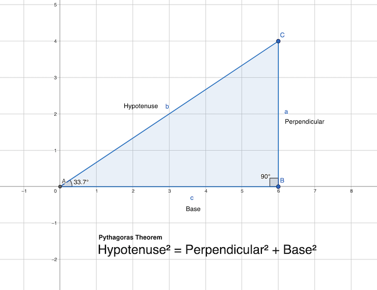
From the diagram above, Hypotenuse is the side opposite to the right angle, perpendicular is the opposite side of base angle θ. The base is the side between the base angle and the right angle.
Pythagoras Theorem states:
Hypotenuse2 = perpendicular2 + base2
Pythagoras theorem itself doesn’t have anything to do with the base angle. But having it in the picture will make it easier for us to understand going forward, as base angle θ is very important in trigonometric ratios.
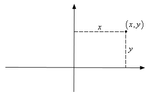
Representation of a point on Cartesian and Polar plane
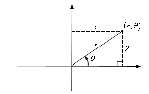
Conversion of Polar Coordinates to Cartesian Coordinates
Formula of Trigonometric ratio
cosθ = base / hypotenuse
base = hypotenuse * cosθ
x = r cosθFormula of Trigonometric ratio
sinθ = perpendicular / hypotenuse
y = r sinθConversion of Cartesian Coordinates to Polar Coordinates
Pythagoras Theorem
r2 = x2 + y2
r = √(x2 + y2)
tanθ = perpendicular / base
θ = tan−1(y / x)Visualizing data on a Radial diagram
To start visualizing data on a radial diagram, first of all we will need to determine what kind of data we are dealing with.
Transforming data to polar form
In general, you will transform values on x-axis to θ, and values on y-axis to r. But sometimes, eg on a Pie Chart you will transform values on y-axis to θ.
Examples
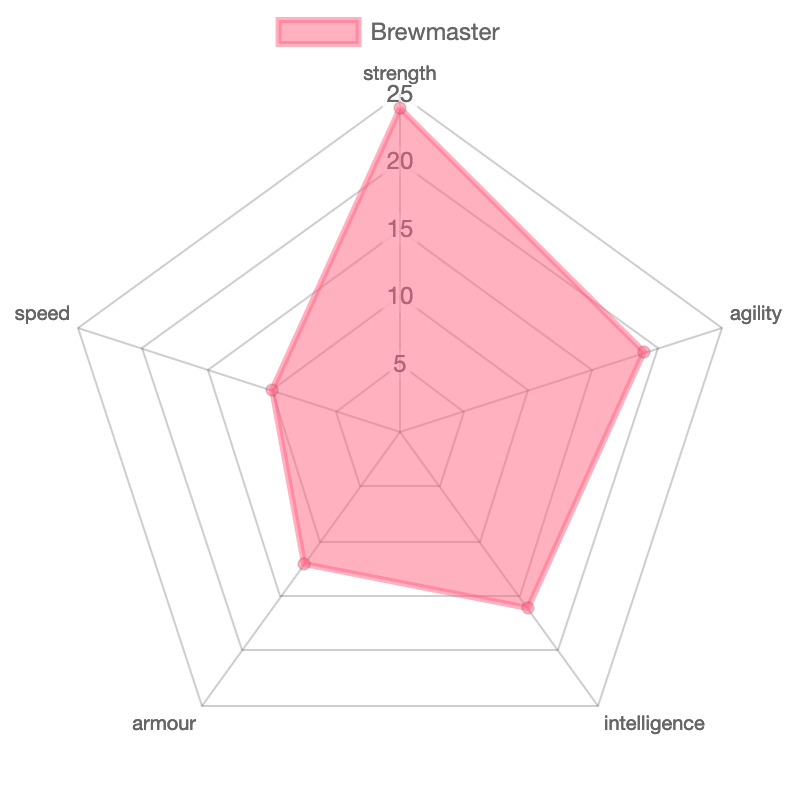
Discrete series data
A discrete series data can be plotted in a Spider diagram.
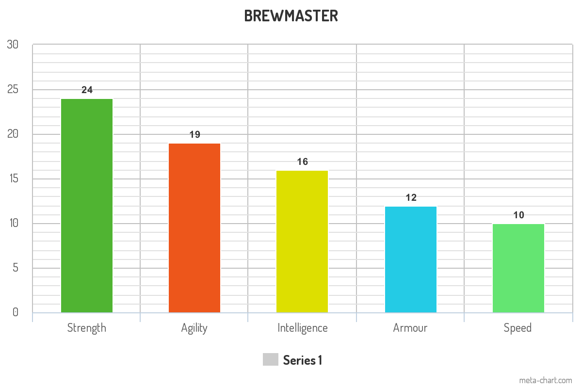
consider the following example data
const brewMaster = [
  { x: 'Strength', y: 23 },
  { x: 'Agility', y: 19 },
  { x: 'Intelligence', y: 15 },
  { x: 'Speed', y: 10 },
  { x: 'Armour', y: 12 },
];
Brewmaster has discrete data of its attributes. Each attribute’s name is plotted on x-axis and value of that attribute on the y-axis.
On a radial diagram each attribute will have its own axis (with varying angle) and the value is plotted on it in the form of distance from the center (origin).
Transforming x-axis
The data we are using is a discrete series, hence the conversion will have fixed axis for each attribute. We will use unitary method to get the angle of each axis, by dividing 360 degree (2π radians) by number of attributes.
const getAxisAngle = (index, axisCount) => {
  return (index * 2 * Math.PI) / axisCount;
}
Transforming y-axis
Transforming y-axis in this example is just about normalizing / interpolating the value of attribute to the radius of the radial plot. The maximum value will be the radius of the plot and minimum ~0. The interpolation should consider also the maximum value on the input side.
So if we consider 25 is the maximum value on any attribute. The maximum radius of the plot will correspond to that.
Plotting on a cartesian coordinate
Once the data is transformed to Polar form, We will need to calculate the position of each data element on the diagram itself as drawing on an SVG or canvas requires us to have things in cartesian coordinate.
/**
   * Polar to Cartesian conversion
   * @param {Number} r Radius / Distance from origin
   * @param {Number} angle Angle in radian
   * @returns
   */
  polarToCartesian(r, angle) {
    // translate origin to center -> (+ this.options.baseDimension / 2)
    //  y -ve because css/svg y is inverse of normal geometry
    return {
      x: r * Math.cos(angle) + this.options.baseDimension / 2,
      y: -r * Math.sin(angle) + this.options.baseDimension / 2,
    };
  }
Periodic data can indeterminately be plotted on radial diagram as θ cycles every 360 degree or 2π radians.
What could be a simple example of that.
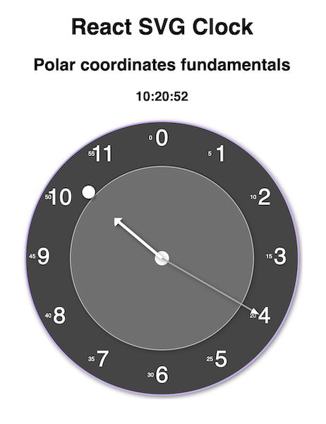
After brainstorming a little bit, I ended up with a tool that was invented in 14th century. It visualizes a data that continuously changes and cycles at certain interval.
A clock!!!
It visualizes current instance of time and each component of time cycles repeatedly. Second and minute cycles every 60 times, hour cycles every 12 times considering am and pm can be assumed.
Next read Building SVG Clock using ReactJs where I have explained step by step how to build an SVG clock from scratch. You can also read my earlier blog post a tutorial on Building Radar Diagram which also uses the same fundamental concept of polar coordinates.